
In this essay I will be comparing a Miss Dior advert and Givenchy advert. I will explore how gender ("the state of being male or female with reference to social and cultural differences rather than biological ones), patriarchy ("a system of society or government in which men hold the power and women are largely excluded from it") and objectification ("the action of degrading someone to the status of a mere object") play a role in the adverts
In the Miss Dior advert we can see Natalie Portman topless covering herself with her arms with the product placed in the middle. The picture is taken from a mid shot so her body and facial expression are in shot. Her facial expression seems to be emotionless however it seems as if her eyes are tying to catch the attention of the person viewing the advert. The colours used in the advert are pinks and other pale colours which are often associated with being feminine colours as well as a font which is elegant
which helps tell us the product is intended for a certain gender (females). The
fact she is topless and her eyes look as if she is trying to catch someone's
attention tells us she is there to be looked at which reinforces
objectification and patriarchy as it is most likely straight men who will
"enjoy" looking at it. Also, the fact her body and face is so
flawless leaves us to presume the image has been airbrushed to give her a look
of perfection and enforce the idea that women must be pretty and beautiful.
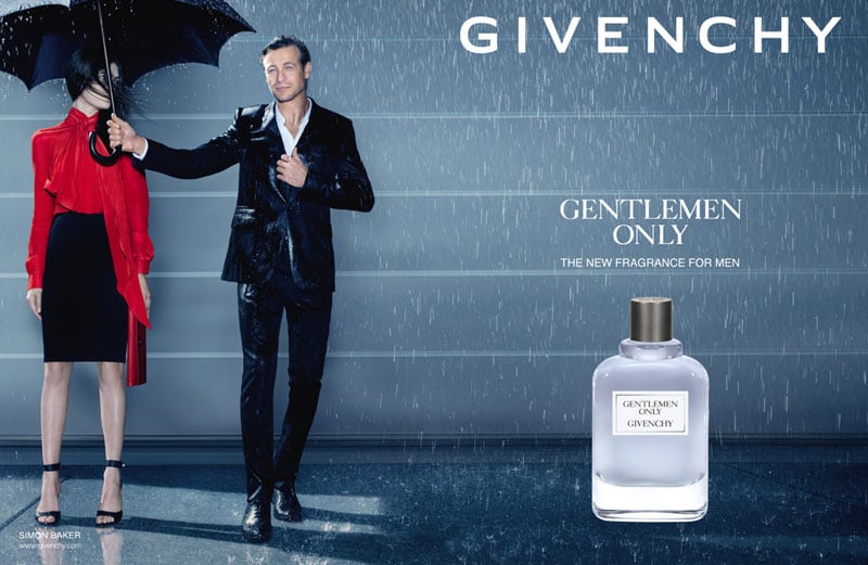
In the Givenchy advert we see Simon baker in the rain
holding out an umbrella next to a brightly dressed woman with the product
placed next to them and the slogan "gentlemen only". A wide shot is
used so that we can see everything that is going on in the image for example
what they are wearing and what they are both doing. The main colour theme in
the advert is blue which also reinforces gender stereotypes because blue is
seen as a more masculine colour. On the other hand, the woman's shirt is bright
red which makes her stand out, this suggests she is only there to be looked at
as this is a men's fragrance and her face is being covered by her hair meaning
she has no real reason to be in the image apart from to be looked at which is
objectifying her. Patriarchy is also shown in this advert as Simon Baker is the
one holding the umbrella over the woman and letting himself get wet. This shows
patriarchy as it shows him being dominant and gentlemen like which comes back
to the slogan "gentlemen" only which suggests only "manly
men" can use the fragrance (which could put other men down).
From looking at the two adverts it is clear gender plays a
huge role is advertising as they are both clearly made to appeal to certain
genders for certain reasons. It is also clear that stereotypes, objectification
and patriarchy are dominant in the adverts as certain colours were used for men
and women, the women were there just to be looked at and the man was the most
dominant. Therefore, I think moves being made to challenge these problems are a
good idea as stereotypes should be challenged so people are not pressured to be
a certain way and women are not seen as objects in the future.
A well written analysis, with some very good points raised. But if the model in the Miss Dior advert is 'looking' as well as being 'looked at' this might challenge patriachy in some way. what about the ASA and the UN? B
ReplyDelete